In this interview we hear from the talented Koko Takeuchi, a diverse and inspiring designer who’s impossible to typecast — she’s that good at everything. See Koko’s inspiring work and read her story right here.
Tell us a little about yourself
I grew up in Nara, Japan and attended 2 years of high school and college (University of Washington) in the Northwest. I’ve been working as a graphic designer for over 20 years in Tokyo and New York. I have been working as a sole designer with my own clients for over 10 years now.
What are you best known for in your field?
I do all sorts of design– including branding/ID, collateral system, packaging, signage, car graphics… it’s really all over the place!
But what I actually love doing most is three dimensional things such as packaging. Even if it’s designing a brochure, I love coming up with interesting folds and housing devices. Did I mention I love paper?
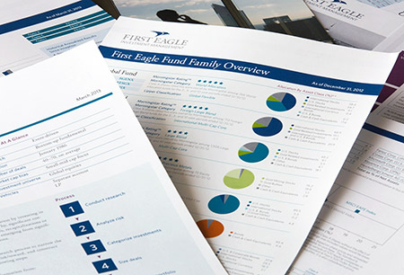
I do quite a bit of corporate IDs as well, and often I use Mohawk Superfine for their printed material. Mohawk Superfine is my go-to paper– it’s super reliable yet easily accessible. Monadnock paper is also very reliable, and I used it a lot in the past. If the client has to reprint something (such as business cards) later and I cannot go on press, I can always count on the outcome to be consistent, not to mention superb print quality. I highly recommend it to anybody!
What is your greatest design influence?
I do love the clean yet earthy aesthetics of Japanese design. So although I do have a lot of respect for people who can do busy, colorful and exciting work, my goal is to always create something elegant with simplicity– with a touch of something different.
What is your primary color palette and why?
My favorite color is black and white (haha)– I love black and white photography, and I’m always drawn to a simple and beautiful black and white designs. In printing, getting accurate color is very important to me. I go on press as much as possible, and even if something is digitally printed, I normally ask for a printed proof before it goes on press. (That is also why I’m very picky with paper– a good sheet never disappoints!)
What projects are you most proud of?
I’ve been doing this long enough that I know it’s not just about how pretty things look in the end. There is a purpose and appropriateness to each project. This may sound cheesy but in the end of the day I’m happiest when the clients are happy and appreciate what I did.
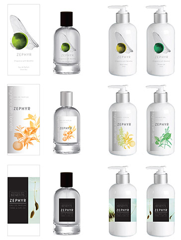
Currently I’m working with two French women who are producing perfume products. The tube packaging for the perfume bottle is wrapped in a textile-like paper. We’re in production and still don’t have a photo to show you yet (except for a few sketches I’m sharing here— a very small part of the entire process!). But we’re very excited– we’ll have everything on the market by this summer.
What is the most important element of a successful client/designer relationship?
Again this may sound like such a cliche, but it all comes down to communication. Managing clients’ expectations, expressing what I’m trying to achieve, why certain things are important to the clients, the importance of visual brand as a whole– even making a day-to-day dealings easier is all up to how you communicate with them. I believe in being honest and straight-forward, and it seems my clients appreciate that about me.
Thank you Koko, for taking the time to tell us about yourself and inspire us all with your exquisite designs. See more of Koko’s work on her website, www.kokotakeuchi.com.
Stationers, designers, paper enthusiasts alike – would you like to be featured on our blog? Email us, we’d love to hear from you!